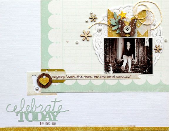
I created this layout for the current crate paper color challenge (more details on the challenge and the amazing sample by Tara here). Not only do I love the colors that Tara selected, but was totally inspired by her in mini album and created this layout with a focus on space.

and also got out my silhouette for some added details... loving this script!

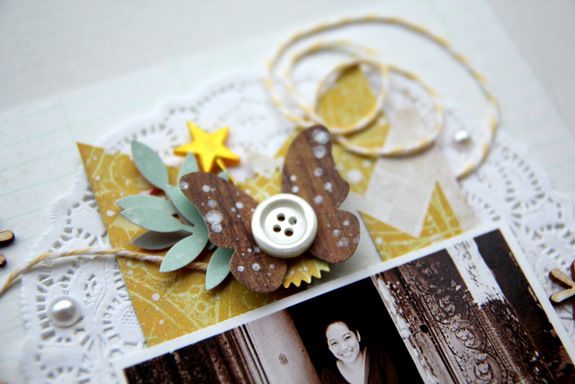
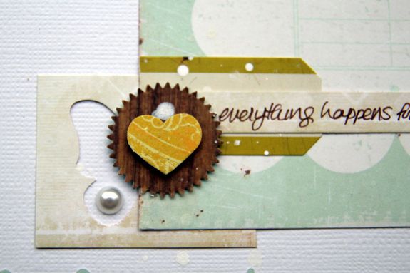
When I created this layout, I really wanted a lot of white space but at the same time I still wanted to utilize all the areas of the page. Therefore I selected two areas on opposite ends where then I started working on... adding bits and boobs (in order to keep my work area small and thus the effect of the white space - or so I hope)...

and also adding some scraps here and there (negative punch out of the butterfly)...

A big big thanks everyone for stopping by and hoping your week is off to a great start!!


love it!
ReplyDeletecherubs
Gorgeous Layout!!
ReplyDeleteYour layout is beautiful!
ReplyDeleteStunning. The colors and design is just fantastic
ReplyDeleteLovely page! You have such a way with your pages. I just love 'em!
ReplyDeleteFunny I saw this on Pinterest before I saw it here! Good stuff! :)
ReplyDeletea big thanks everyone and that's really funny Kathy :)
ReplyDeleteI super love this layout!! Everything is so pretty!
ReplyDeletelove the colors
ReplyDelete