I'll be honest, I don't always like everything that I create. At the time it "looked" ok, but then after a while or once the pictures are taken, something is off.... Most of the time, that "feeling" / "look" can easily be fixed by adding a bit more embellishment or changing the colors of some of the items used... but then there are times, when it really feels "off".... and yesterday was one of those times.
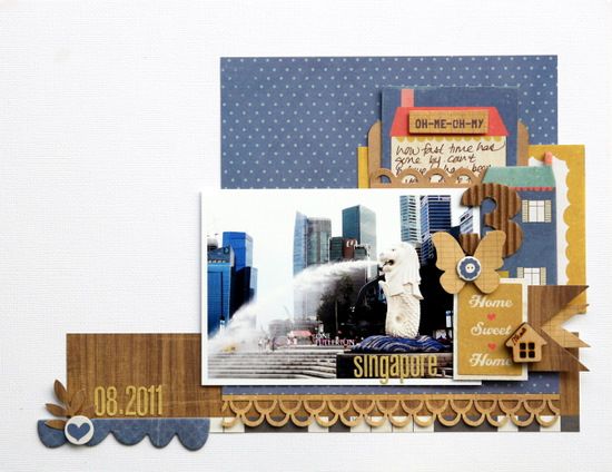
So ... I redid my National Day layout. This time around I went with a 11x8.5 layout and also made sure that the embellishments flows from right to left - in line with the water in the photo.
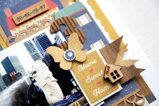
most of the items I was able to salvage from the previous layout (the wonders of removable adhesive).... but lost my sub-title. Initially I was thinking of additional journaling on the bottom of the photo (before the punched scallop border), but then realized that I already had the journaling tag... ooops.
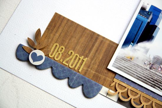
And honestly (I know again) - I just love love love these ABC stickers from Lily Bee. I can't wait to see the new ones/colors... (the papers are absolutely gorgeous in person)!
thanks for stopping by everyone, and just curious - do you have days like me? or is it just me? ;)
ps. I still do like my first layout but felt that the flow of the embellishment/page was contradicting to the flow in the picture - if that makes any sense at all? for me - when I look at the first layout I'm first drawn to the clusters of elements on the bottom and then work my way up to the top of the page. However, when I look at the picture - it goes from right to left... uhmmmmmm


Awesome job! I like the redo even though I liked the original...this definitely has a better flow to it!
ReplyDeleteYou're not alone....I'm just glad to know YOU have days like mine! :)
*sigh* I want to come see the Merlion again!
Oh, I loved the first one too but this one is gorgeous too! I have times where I re-do. Most things really are reusable and it will drive me crazy if I don't fix it. I guess we are our own worst critics though. :)
ReplyDeleteBeautiful results!
ReplyDeleteDitto! I wld redo some pages after i put it together + realise it's not the right feel. Not sure how u cld salvage so many items coz my glue wldn't barge!! LOL.
ReplyDeletethanks guys for all the sweet comments... and as for adhesives - I tend to use removable ones (unless they are for display projects)
ReplyDeleteWell, I liked your first layout but then once I see this one... I really really REALLY like this one better! You are just amazing, Piradee!! :)
ReplyDeleteboth LOs look good to me.
ReplyDeleteand i kind of understand when you talk about the picture flow and all.
you're still awesome!!!
^.^
fabulous page!
ReplyDeletepiradee, piradee... both LO looks great to me. I tot the first one was intended to resemble a house with the brown colored border trim as a roof; the grey bottom border as a staircase -- as the mini title was 'home' :)
ReplyDeleteand yes, i redo my LO at times too, cos it just doesnt look OK to my eyes :)
I did love the first design but you are right - the eye goes straight to the cluster of embellies whereas with this it goes straight to the photo - definitely better design although I did love the first as a layout design...maybe you could scraplift it with a different photo?
ReplyDeleteAfter reading this post, I had to go back and look at your first layout because I hadn't seen it. Now I know what you are talking about! Both are great, but I really love your second attempt ;) And yes I have days like this all too often it seems lately. My problem is that I don't go back and redo the page, once it's done that's it!
ReplyDelete