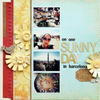
there was however one place that I wanted to visit again - parc guell - and would do it again and again. I just can't get over the amazing architecture and those houses are so adorable and the lovely tiles and how they just sparkle in the sunlight....

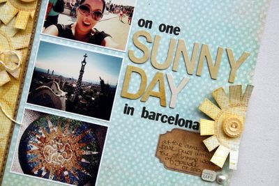
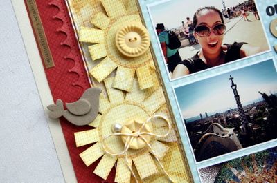
and here's alittle something that I created to capture that moment... and yes, it was one really sunny day too! I wanted to do something simple for this layout, but still couldn't resist cutting out those sun designs from the fancy pants papers...

and I also tried to kept the colors constrained on the layout - reds on reds, yellow on yellow. Initially when I did this, I wasn't sure if the objects would show up, but really like the final outcome whereby you can add/layer items but still have an overall simple look.... (or so I think)

supplies used include:
cardstock: american crafts; pattern paper: fancy pants; chipboard bird: maya road; mist: tattered angels; stickers: crate paper and basic grey; chipboard alphas: the girls paperie; buttons: jenni bowlin; edge punch: martha stewart.
thanks for stopping by and all the wonderful comments (yes, I'm back...lol). Also could I get your help on something.... how would you describe my scrapbooking style? Recently I've been asked this question and honestly, I don't know...
and guess what I saw on 2peas (Sept 22nd): thanks everyone for your support!


So beautiful and hip, Piradee. I love it!
ReplyDeleteHHHmmmm, describing someone's style is so hard, describing your own style is even harder I think!
ReplyDeleteMaybe I would say your style is 'clean and classy with an arty-edge!'
Love the tone on tone look you've created on this layout. Beautiful :-)
hi Piradee! love yhour layout and photos!
ReplyDeletei would say your style is kind of "vintage graphic",or "graphic vintage" !! i don't know!! clean lines but with a free twist! not easy to describe a style! yes , and i agree with natalie about the "arty" twist too!
good luck for that !! and thank you for sharing your expereince in barcelona!
i like the tone on tone idea too !
ReplyDelete& apparently your style could be described as "modern vintage".
If not then clean & simple with a twist of modern vintage . :)
Love this layout! The colors are just perfect. It highlighted the photos!
ReplyDeletehi Piradee.. i always adore your layout.. everytime there's a twist in it.. =)
ReplyDeleteit is definitely hard to describe the style.. from my pov, you have a touch of 'everything' in your LOs.. =)
so to describe it, i would have to agree also with what Natalie says, it is clean and classy BUT definitely it has an arty-edge. =)
Love the tone on tone look here! I am terrible at describing my own style, let alone yours! I agree with what the others have said - clean and simple with an edge. And I like Pearl's description of "modern vintage". It doesn't matter though - I try not to get caught up in defining my own style. It varies so much from layout to layout, that I have given up trying to define it LOL...
ReplyDeleteI love the flowers. Super cute and definitely a technique I am going to try!
ReplyDelete