Also was a bit late in posting this because I made a few changes here and there (and still not too happy about it). For some reason when I saw the layout being posted on the CCG website, I just didn't like how it looks and how unbalanced it felt... so went with a bolder font for the title and switched around the journaling.... what do you guys think?
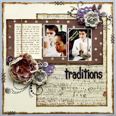
the before....

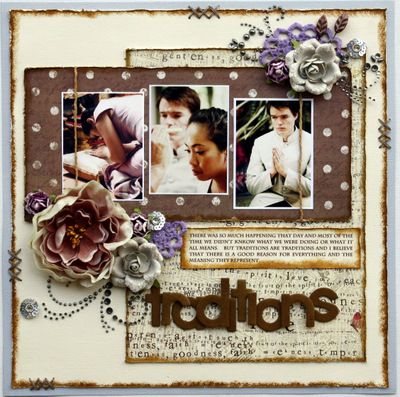
and the after.... I know, the title still doesn't feel right (and is abit off balance, I really can't work with anything else other than straight lines).

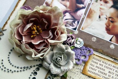
and just loving these blooms from prima, been hoarding them for awhile now...

supplies used include:
cardstock: american crafts; pattern paper, flowers, crystals, flower centers: prima, alphas, leaf pins: maya road; ink: tim holtz
inspired by: prima june BAP sketch
even after the changes, still don't really like the overall look of the layout. not sure what's been happening lately but spent the day today fixing layouts (this is my third one in which I re-did something)... but at the moment, just clueless in what to do with it... oh well, but I really hope i get my mojo back really soon as there's a few assignments due next week. :(
thanks for stopping by.


I love how it looks in the 2nd pic!! the title looks Amazing!!! Love those flowers too!!!
ReplyDeleteHave a great weekend!!!
You are too funny - I'm sure it looked totally fine in the first place as well - but I know the feeling when you look at a layout and something just isn't 'right'. It looks fantastic now - the distressing is marvelous! just the right amount of embellies and bling - love it
ReplyDeleteBoth are beautiful but I like the 2nd one better, mainly because it has three photos. But it just flows better too.
ReplyDeleteI know what you mean about just not being happy with a page! And also the purple thing!
Sometimes I get 'scrappers block' and I find it's best just to take a break. That's a bit tricky if you've got deadlines though! I saw some of your work in the Scrapbook Inspirations Idea Book, it's lovely!
ReplyDeleteI love the design and the 3 pics of the 2nd and the alpha from the first. Regardless, they are both beautiful! Very beautiful!
ReplyDeletethe 2nd one is great! and relax and have a drink... am sure yr mojo will be back real sooon...! work stress right! ya! have a fabulous sunday :)
ReplyDeleteI agree with you for the first but the change in the 2nd is perfect! Love the way you did the color balance; trust me, it's lovely!
ReplyDeleteLooks great! Just go with whatever makes you happy :)
ReplyDeletehey darlin'! they are BOTH beautiful, I replaced the image for you at CCG, if you think this one is better! :D and you did AWESOME with the purple, not my particular color either, but that is the beauty of the challenge isn't it? You ROCKED it!!
ReplyDeleteawww Piradee! They are BOTH gorgeous! But then when you changed it I like the second one better. But I truly loved the first one as soon as I saw it. Your work is soooo inspiring. YOu have nothing to worry about! :)
ReplyDeleteLove that second layout and those colors are beautiful together! You do great work!
ReplyDeletePeace,
Anita